New Trinity Map
MAP THEORY
People have used maps for centuries in order to better understand their surroundings and place in the world, but we have to remember that every map is just a representation. As in many other areas of graphic design, maps have their own spectrum of abstraction—some try to be precise by representing every detail, others take design liberties for aesthetics, and many fall somewhere in between—cartographers render ‘precise’ maps, and designers render informative maps. The only way to precisely represent the campus at Trinity is to walk someone, building by building, sidewalk by sidewalk, through its curves, wooded boundaries, slight incline, and warm brick facades. Otherwise, every map of campus is an abstraction.
MAP DESIGN PROCESS
In order to better understand how students, staff, faculty, and visitors experience Trinity’s campus, the design process started with a composite of satellite images. This view of campus gives one of the most precise views of campus, which led to the first iteration of the map.
REALIZING THE DESIGN ISSUE
It wasn’t long into rendering an ‘accurate’ map before the main issue with information clarity revealed itself: Trinity’s camus has both walking paths and driving paths which diverge and converge in multiple instances. At first this seems mundane, but when thinking about many other maps, there is usually only one pathway type that needs to be identified. In maps of hiking or skiing paths, a map only needs to represent the walking paths in relation to the mountain. In the awarded WalkNYC maps by Michael Bierut of Pentagram, the sidewalks and streets share every pathway, and so only need to show a single path. Massimo Vignelli’s lauded Subway maps only needs to represent the order and general directionality of the subway system and stops because our experience of travel (in space and time) become so abstract on subway cars and dark tunnels. Trinity, however, is small enough to understand, but large enough to use a car, and those two path types created an interesting design challenge.
U.S. National Park Service Mariposa Grove trail map, showing trails to the Grizzly Giant, California Tunnel Tree, and more.
WalkNYC – The maps use a 'heads up' orientation that corresponds to the direction the user is facing.
Massimo Vignelli’s
1972 NY Subway map.
RENDERING
In the first iteration of the map the roads and walkways are accurately drawn according to the satellite images. The benefits of the rendering are accuracy—one can see the scale and positioning, relationships relative to parking lots, buildings, walkways and driveways. The major disadvantage, however, is that some walkways are unclear, some buildings look askew, some intersections are hard to follow, and for a visitor who may not have the nostalgia associated with attending Trinity, the map is less clear than it could be.
COLOR, LEGIBILITY AND HIERARCHY TESTS
While all of this rendering is happening, other design problems are being worked on simultaneously—what colors are the roads? The walkways? The buildings? How do these colors (colors of the roads and parking lots, or colors of the walkways and buildings) relate to one another? What combination of colors reveals what users are looking for and dismisses the information they aren’t? This multitude of design tests ultimately ultimately lead to better hierarchy and help clarify the goals of the design project which is to get people on campus to where they need to go most effectively and effortlessly.
REDRAWING, RETESTING AND REALIZING
Once the map was drawn and the test were made, it became clear that the first solution wasn’t working—there needed to be more clarity of information even at the expense of shifting the design further down the abstraction spectrum—towards a Vignelli-style map.
From top left to bottom right: Map Grid; Line colors to test visibility, contrast, and color pairings; Icon color and contrast tests.
FINAL MAP
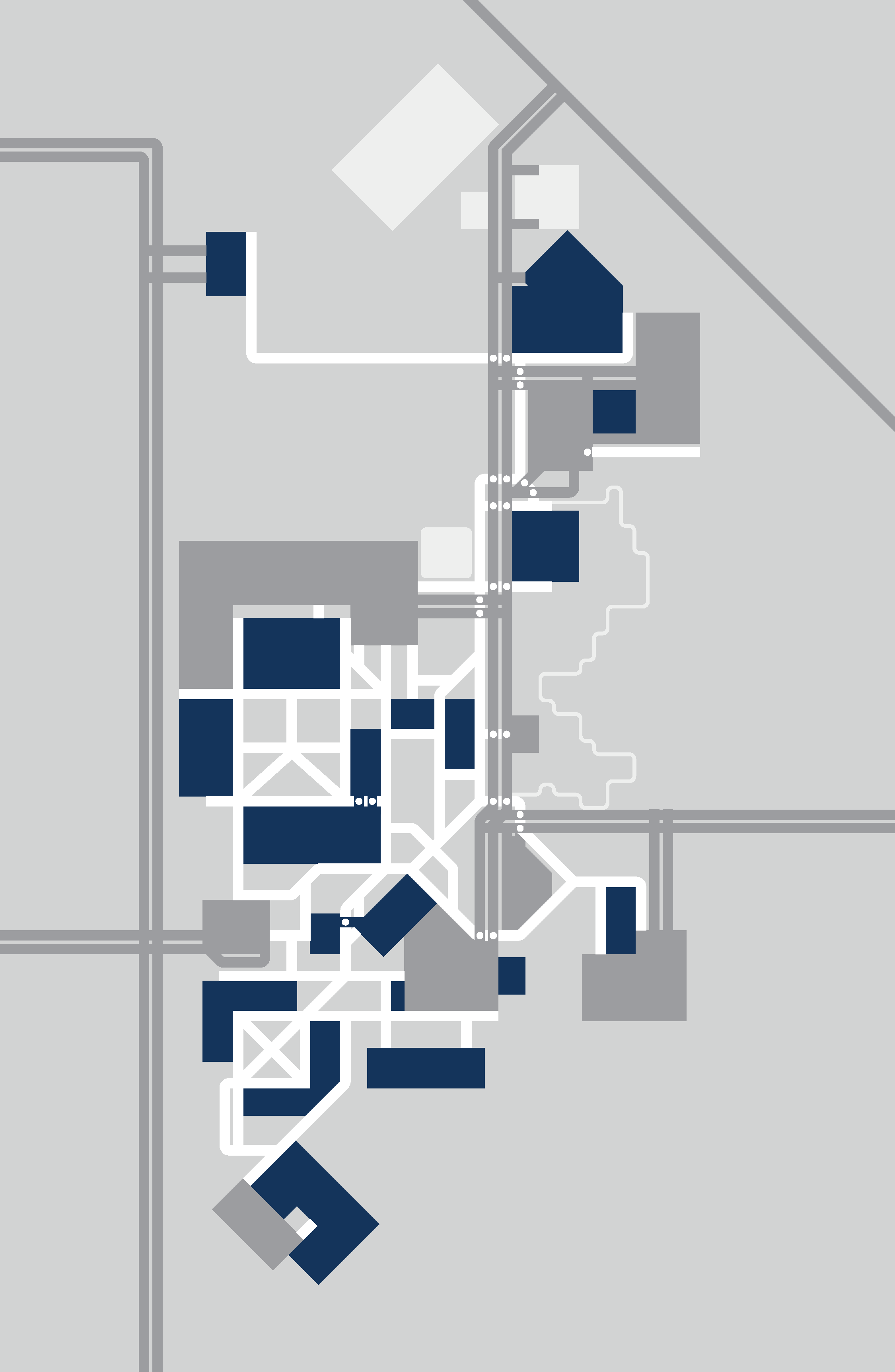
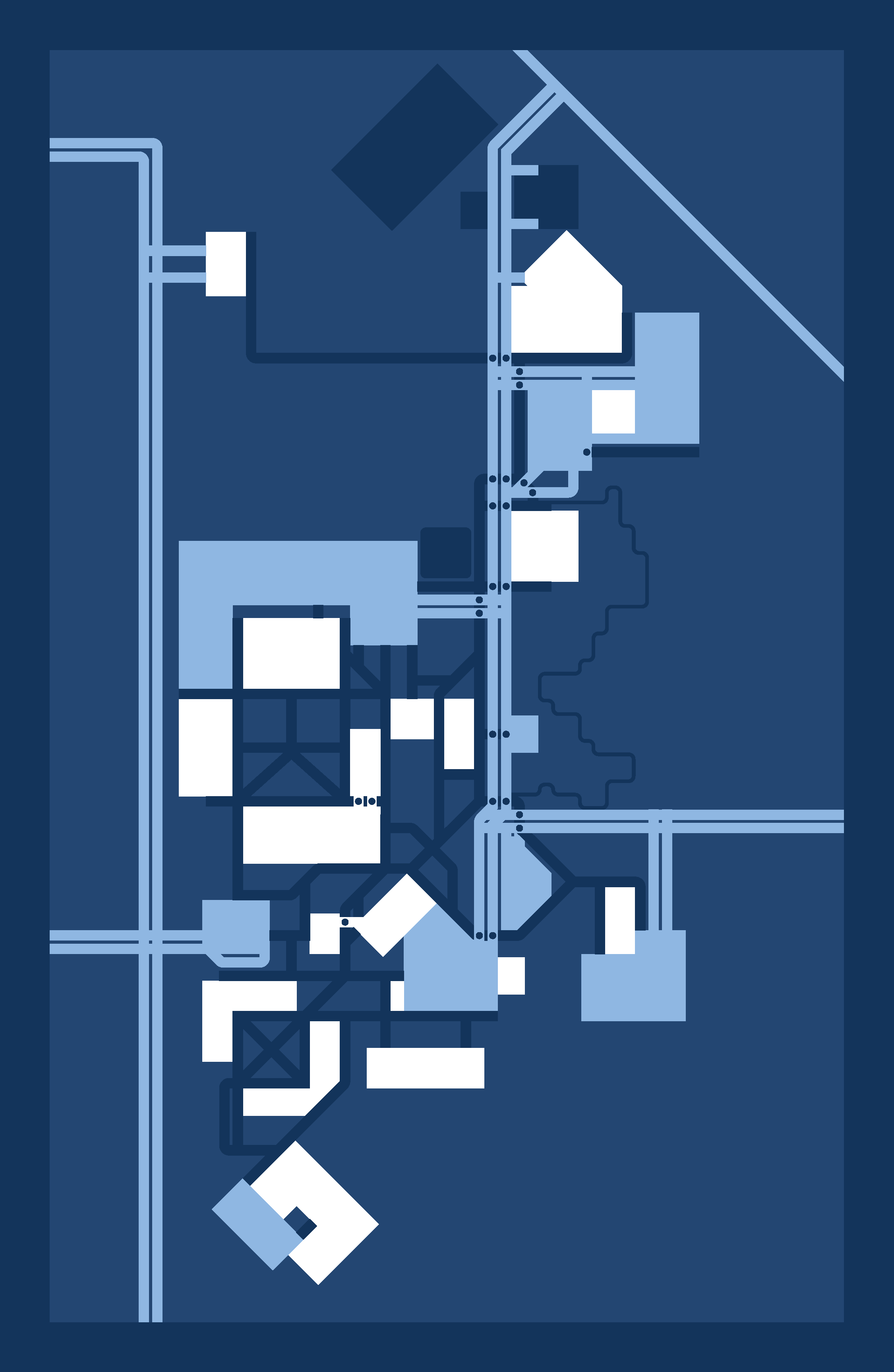
The Trinity map is designed in the modernist style, set on a horizontal and vertical grid of alternating 3:1 line:gap ratio (in light of the Trinity), with all lines at perfect 45º increments (in relation to cardinal direction), using only Trinity blue and two greys. The roads and parking lots are the same color indicating their relationship, use by a vehicle, and physical tie to pavement. The buildings are Trinity blue and the white, unobstructed lines (not marred by ink on the page) leading to them are walkways—paths that have been made clear through campus planning. The final map is clear enough to show both buildings and parking lots simultaneously and can be used to hold many different types of information such as the events schedule and location for this year’s Fall Fest. It’s even beautiful enough to change colors and become a Christmas card.


CLASSES AND TEACHING DESIGN
These processes are taught in the Design programs at Trinity. Students learn how to frame problems, how to listen to and heavily consider their end users, and how to constantly ask for a better solution. Trinity art and design students learn how to learn—how to question what it is about their work that isn’t working, how to iterate, and how their roles as an artist or designer impacts our larger culture. For a project like a map design, our role is to ease and shepherd our visitors into what it is they’re looking for, to give current Trinity students, staff, and faculty a clearer perspective on where it is they are, and to create a beautiful design that can last a lifetime of campus improvements, changes, and possibilities.
